White Square

Real EstateB2CMarketing Page

White Square is a Georgian real estate development company presenting residential projects, available apartments, company information and direct sales opportunities through its website.

Project Overview

Industry
Real Estate
Role
Product Designer
Product Duration
2 Months
Key Markets
Georgia
Growth Stage
Enterprise
Company Size
50+

The Challenge

The website needed to present multiple residential projects while helping potential buyers quickly understand what made each development different. The main challenges were:

  • Project cards provided limited information
  • Important property details lacked a clear hierarchy
  • Projects needed stronger storytelling beyond technical specifications
  • The visual experience required greater consistency
  • Repeated interface elements were not supported by a unified design system

Product Analysis

I reviewed the existing website structure, project presentation, content hierarchy, repeated interface patterns, and the journey from discovering a development to contacting the sales team. The analysis highlighted three main opportunities:

  • Make project discovery more informative: Provide useful details directly within project cards so visitors can understand and differentiate developments more quickly.
  • Build stronger project narratives: Present each development through a clearer sequence of concept, location, benefits, features, and available options.
  • Create a scalable visual foundation: Standardize typography, spacing, colors, cards, buttons, and content patterns through a reusable design system.
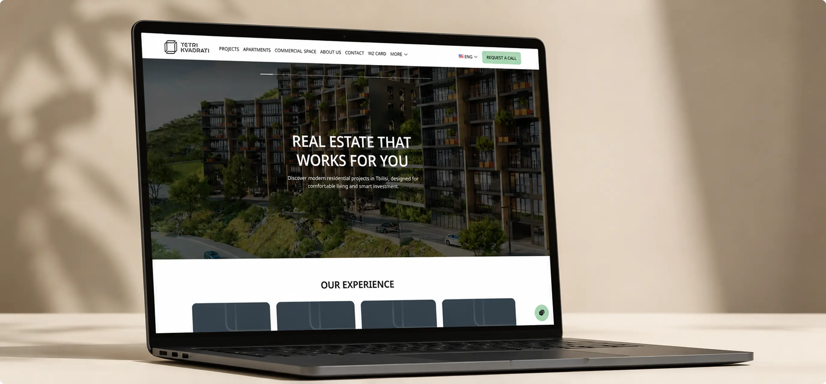
White Square website homepage displayed on a laptop
White Square website interface icon set
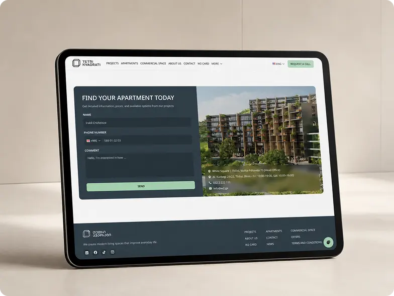
White Square apartment enquiry form displayed on a tablet
#283B40
#ABD9B9
#BAC6CE
#9B8B82
#161414
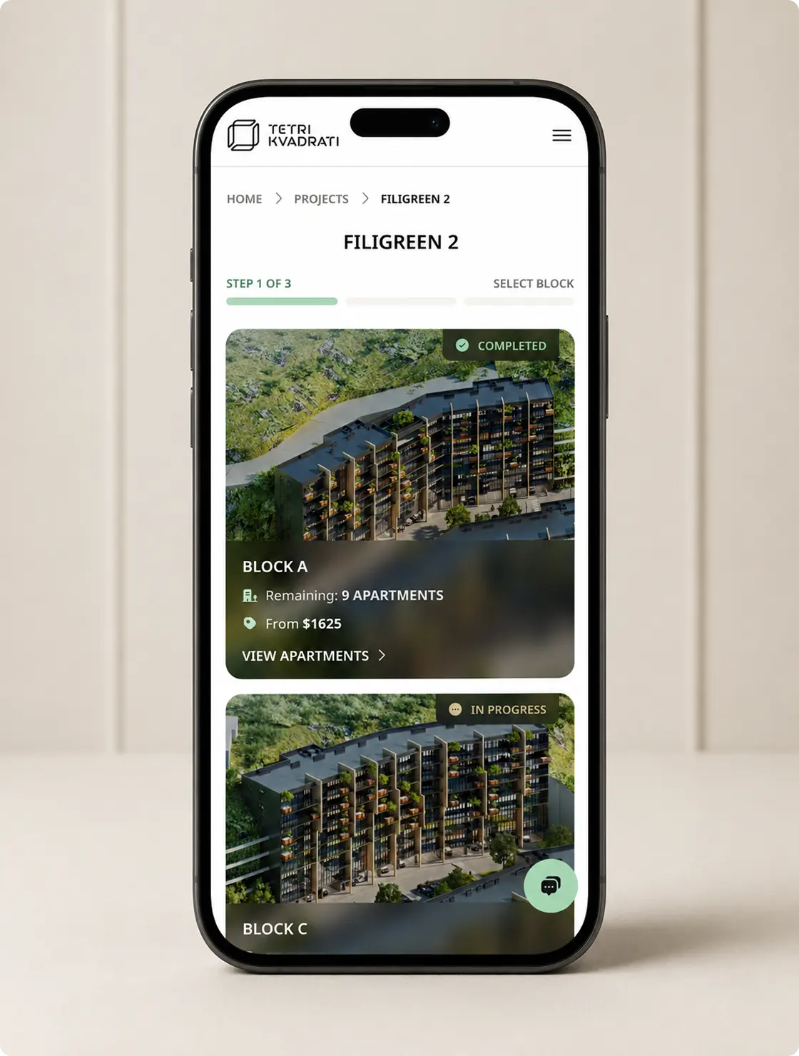
White Square mobile block-selection interface for the Filigreen 2 development
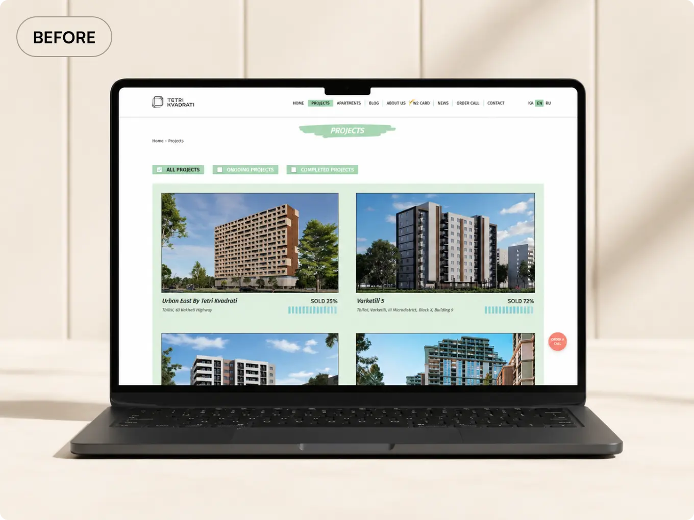
Previous White Square projects page displayed on a laptop
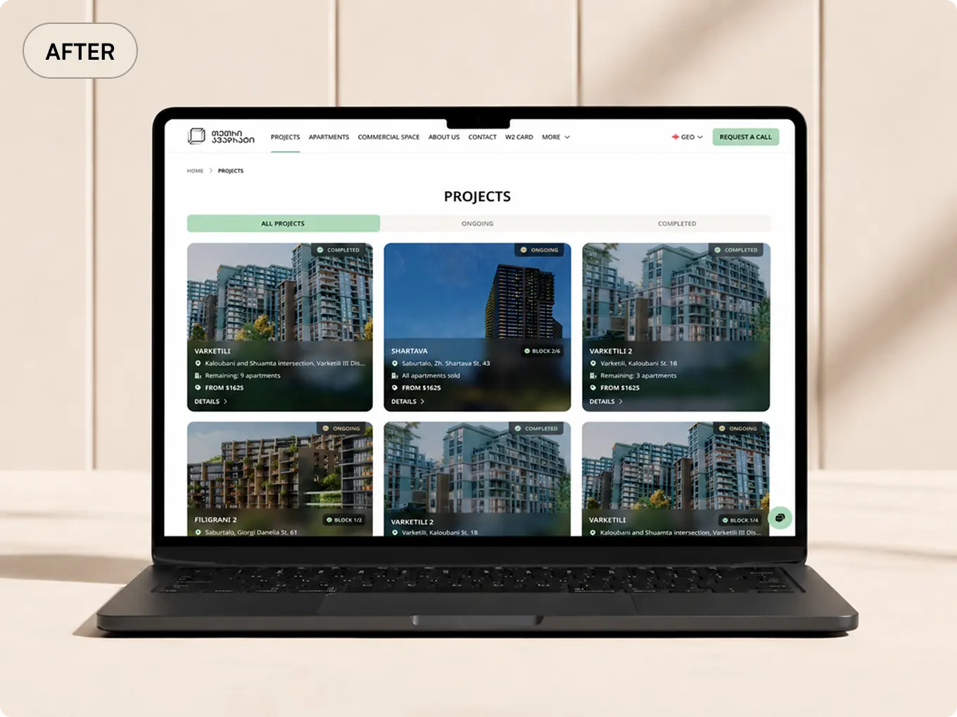
Redesigned White Square project discovery cards displayed on a laptop

The Solution

  • Visual Refresh: I introduced a cleaner and more contemporary visual direction that better reflected the quality and scale of White Square's residential projects. Typography, spacing, imagery, and interface elements were refined to create a more premium and cohesive experience.
  • More Informative Project Cards: Project cards were redesigned to communicate more than a project name and image. Important details were brought forward so visitors could understand each development's location, status, positioning, and key characteristics before opening the full project page.
  • Improved Project Storytelling: Individual project pages were restructured to guide visitors through a clearer narrative. The experience introduces the project, communicates its concept and benefits, highlights important features, and gradually leads users toward available apartments and sales actions.
  • Clearer Information Hierarchy: Content was reorganized to make important information easier to scan. Headings, descriptive cards, imagery, specifications, and calls to action were given clearer roles, helping users move between high-level information and detailed project content without feeling overwhelmed.
  • Design System: I created a reusable design system to ensure consistency across the website and support future growth. The system defined typography, colors, spacing, buttons, form elements, cards, navigation patterns, and reusable content components.
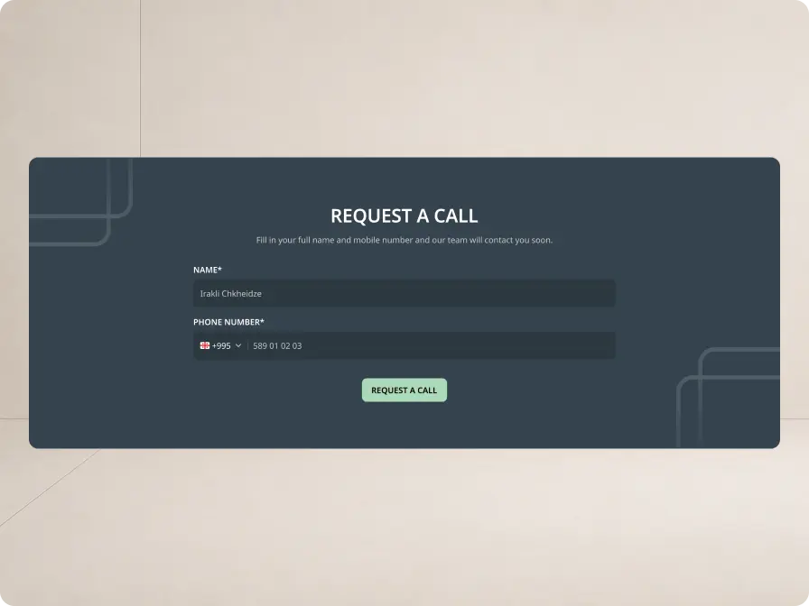
  • Accessible Sales Actions: Contact and sales actions remained visible throughout the experience without competing with project content. The redesigned hierarchy allows visitors to first understand a development and then move naturally toward exploring apartments or contacting the sales team.
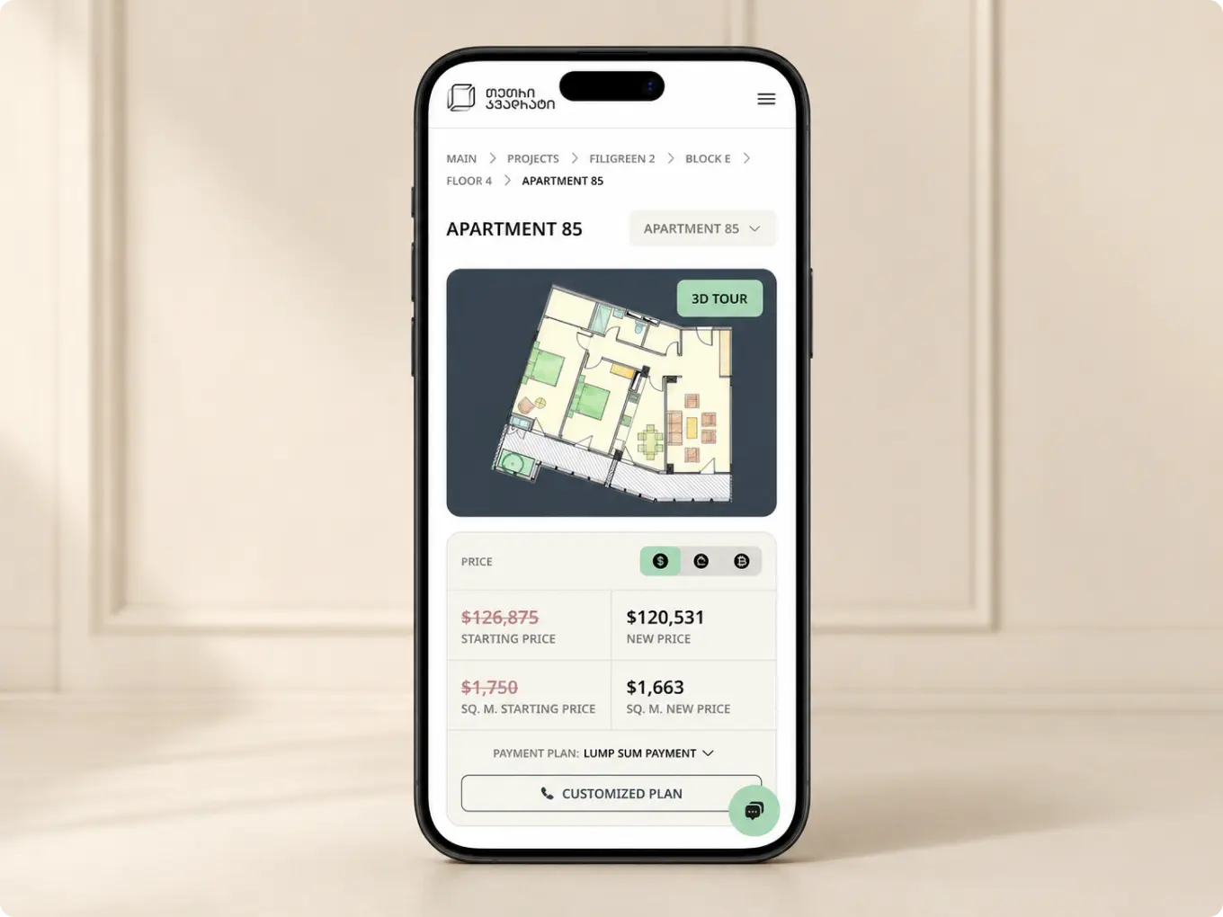
White Square mobile apartment detail page with floor plan and pricing
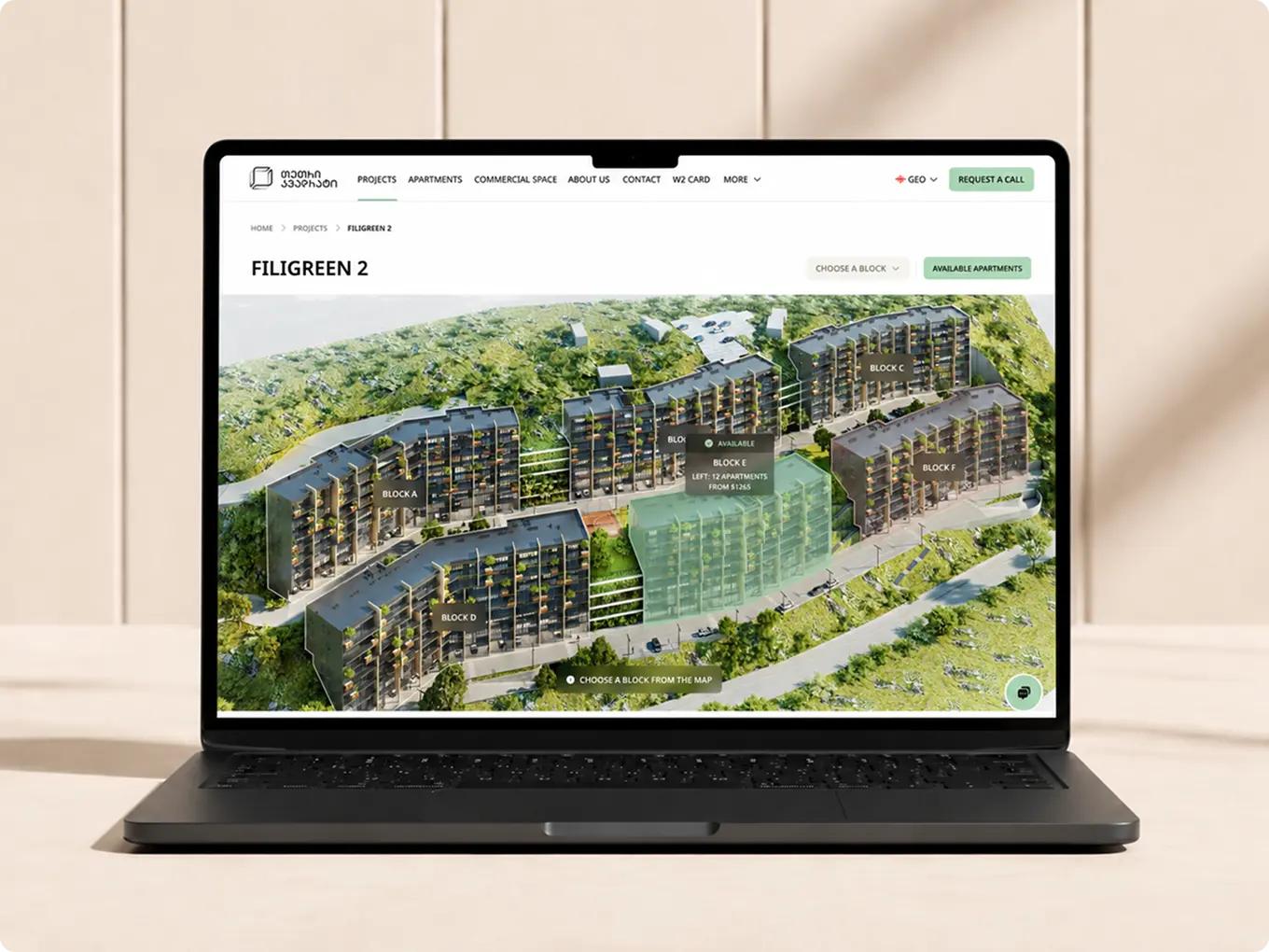
Interactive Filigreen 2 building map displayed on a laptop
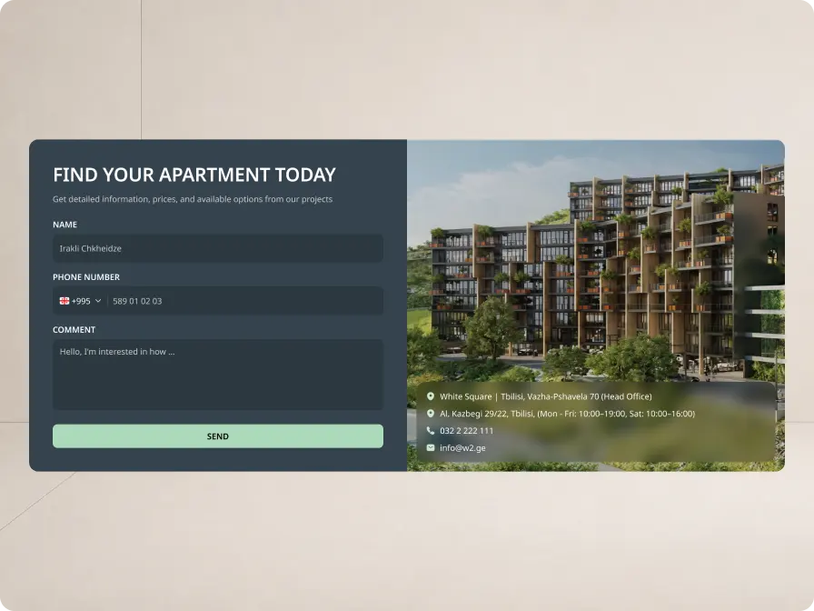
White Square apartment enquiry form with development contact details
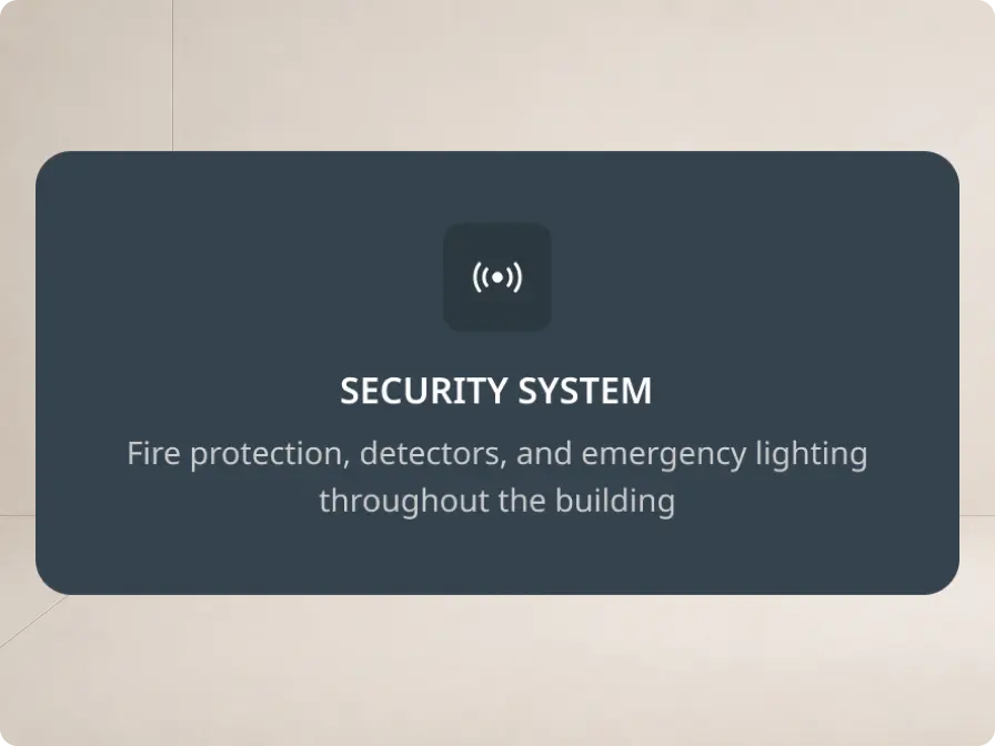
White Square building security-system feature card
White Square request-a-call form

Outcome

The redesign created a more polished, informative, and story-driven digital experience for White Square.

The refreshed visual direction strengthened the company's online presentation, while richer project cards made developments easier to discover and compare. Improved storytelling and content hierarchy transformed technical property information into a clearer and more engaging browsing experience.

The new design system also established consistency across the website and created a reusable foundation for future projects, pages, and features.

Overall, the project produced a more cohesive and scalable website that presents White Square's developments with greater clarity and connects project exploration more naturally with sales actions.

Explore More Work

View Project